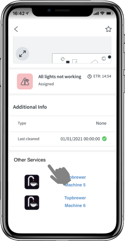
The Space Information Page is the core part of the app whereby all the information related to that space is shown. This information is determined by the space type and through the configuration provided by your administrator. The components of the page are listed below.
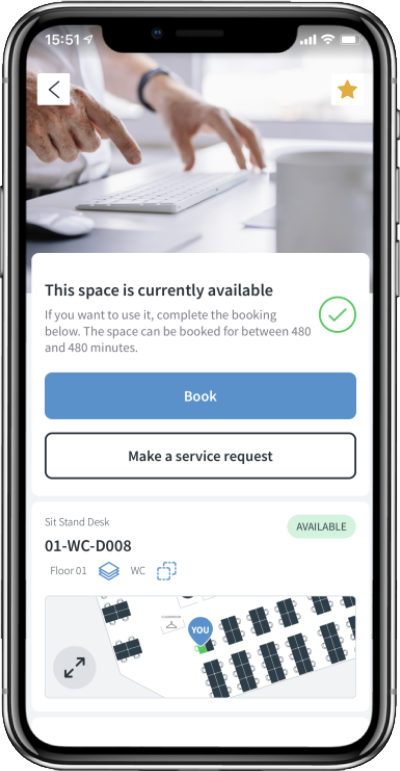
The Space Type Image is shown at the top of the page and can either by a standard image provided within the app or a specific image provided by your administrator.
A favourite star is shown on the top right of the page. See favourites for more information.
Below this is the Space State Card which provides information on the current state of the app and the associated call to action buttons. These will change based on the state of the space (Available, In Use, Requires Cleaning, Out of Service).
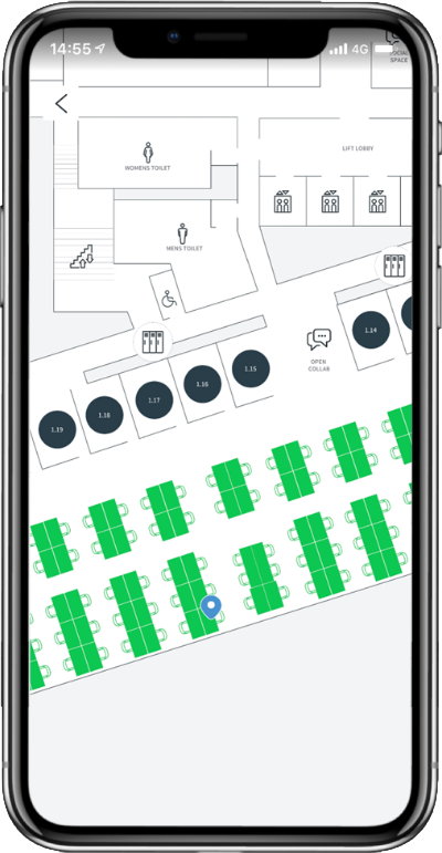
Below this is the Space Map Card which provides a map view of the space. Clicking on the expand button on the map will provide a full screen view of the floor together with the state of all the configured spaces.
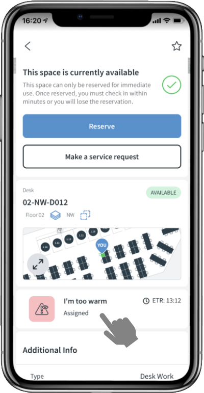
Below this is the Space Fault Card which will show any active tasks that are associated with this space. It will not show if there are no tasks.
Below this is the Space Control & Information Card, typically only shown for rooms, which will show any room guides and controls that are associated with this space. It will not show if these are not enabled for the space. Space Control provides temperature/lighting/blinds/IT and AV control as well as on-demand catering requests.
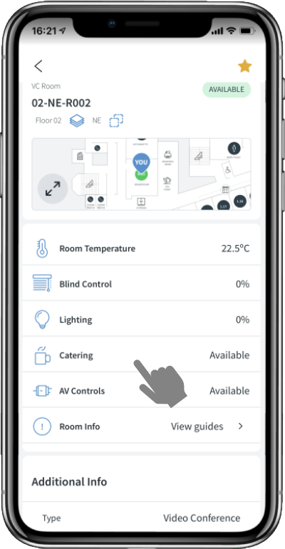
Clicking on the View guides menu item will open the list view showing all the available pieces of information relevant to this space.
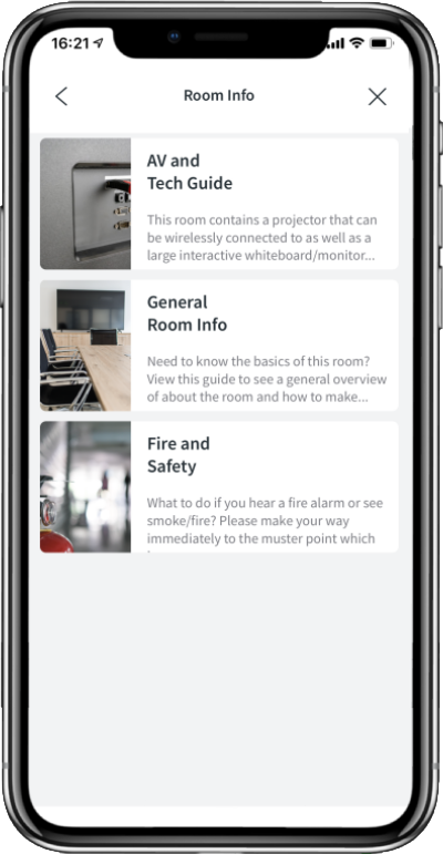
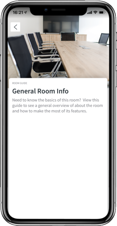
Tapping on the list item will open up a full-page information view as shown below.
The Additional Info Card will show some additional information about the space, and finally, if configured, a Custom Info Card will be visible which can provide any HTML content
